Role: Product designer — discovery, ideation, product research, user testing, UI design, A/B testing
Team: Senior designer, 2 PM, 1 engineering manager, 3 engineers
Timeline: 2021
Overview
Following an acquisition, I joined a newly created team at Care.com slated to focus on senior care. This team was tasked with migrating to a completely new tech stack, adopting new design system components, and tackling conversion in our most high traffic area: enrollment.
TASK
Creating incremental value
After several months of iteration, we landed on an enrollment experience that yielded the best conversion rates we’ve seen. However, we were faced with the question: what next? Tech debt prevented us from tackling parts of the Senior Care experience down the funnel like search and the member homepage. In order to provide value to our families, we had to find a new way to search and match high quality, relevant, and available caregivers to seniors care seekers who need care.
APPROACH
Identifying areas of opportunity
Messaging caregivers is our main value prop for upgrading to a premium membership. And, if someone didn't upgrade during their first session on Care.com, they were unlikely to upgrade at all. By not supporting families during their search process (i.e. providing an incentive to upgrade their account) we were missing out on revenue.
the challenge
How can we help families find relevant, high quality caregivers that they want to interact with?
Migrating to a new tech stack meant that we needed to launch a light MVP. Moreover, other pages in the enrollment like the pricing page were owned by different teams. When these challenges started piling up, I felt overwhelmed. How was I going to deliver on promises to user without updating search or the member homepage? At the time, weren't guiding users to the next best step, search was broken, and I could only see gaps in the top of funnel experience.
Thankfully, my design manager, Michael Villas, and PM, Jason Thai, suggested refocusing on success metrics to drive my initial research inquiries. With a new, success-oriented mindset, I used the following metrics guide early research questions:
✳︎ number conversations started by families
✳︎ percentage of families viewing at least 1 profile
✳︎ basic to premium conversion
Search directory before and after
action
Making informed design decisions
We used data from ADI partners to map high drop-off screens in our post-enrollment and first-time visitor experience. With a greater understanding of family behavior, we created hypotheses about the low conversion rates. I conducted market research and usability tests to validate our hypotheses and identify gaps in our current experience.
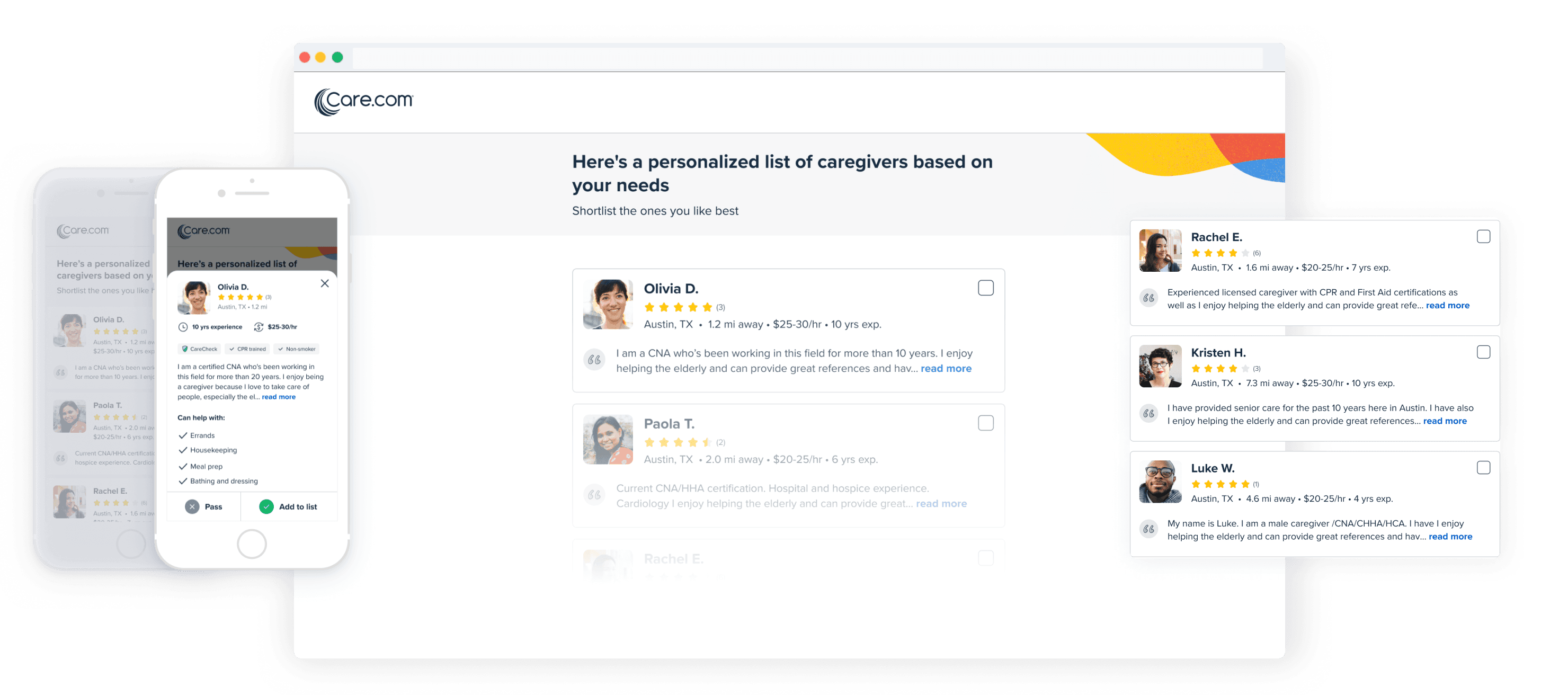
Usability tests revealed:
✳︎ families had trouble deciding on a caregiver to message
✳︎ existing search experience didn't show relevant caregivers nor had a way compare caregivers
✳︎ families preferred comparing caregivers before making a final decision on who to message
Taking inspiration from unlikely places 🔒
Enjoying this case study? Reach out to me to learn more about my process and the impact my work had at Care.com and the senior care vertical.